


Creating an effective sign design can be an art-form. This is why at LowCostSigns.com we have designed the professional sign design templates for you. However, we want to help you understand key concepts to designing an effective sign versus a sign that could actually hinder your attempt at soliciting your viewing audience. We have seen many non-effective designs where the layout has all the text and lettering crammed and distorted and the message does not flow. We feel that it is very important to determine what exactly you are trying to convey to your customer. For example, in the image below we show a sign design that is not effective, compared to an effective sign design.
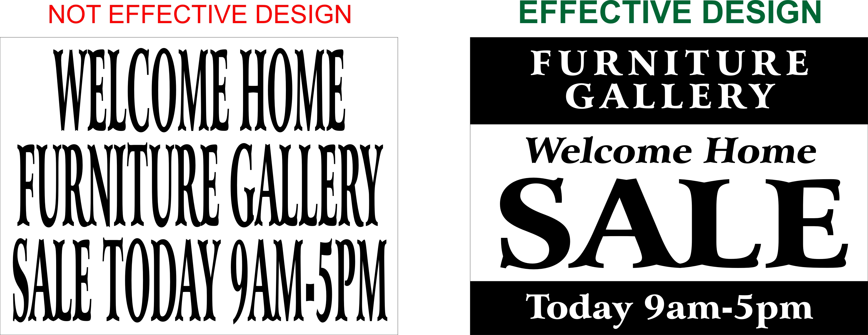
The sign on the left tells the story, but the reader at first glance will not even read the sign because it is not legible. In this layout, the most important message is that the business is having a “Sale”. The sign on the right allows the reader to understand the entire message without really even thinking about what is happening.
Sign Design Layout: Legibility
Over the years, many of our clients have requested that they want the letters as large as possible and have sent us sign layouts like the example above. When it comes to an effective sign design there are many considerations, however the two most important factors are legibility and contrast. Legibility is quite simple. If you cannot read the sign due to small letter height or an ornate font, then you may not have an effective sign. Signs are typically read from a distance of 20 feet or more. Therefore, if your sign lettering is too small to be read clearly from a distance then the intended audience that you are attempting to appeal to will be lost.
Letter height is very important, for example a typical viewing distance for a 4 inch tall block letter is readable up from about 100 feet away. Compared to a 16 inch tall block letter is readable up to 1 city block or approximately a 360 foot distance. This is where many of our customers over the years have been confused when it comes to proportion of letter height and the corresponding length of the letters on their sign or banner. For example, we have had customers that want to order an 18″x24″ corrugated plastic yard sign and when they discover that they need a 16 inch tall letter to be readable from a city block distance, they want that size of letter. Well, a good rule of thumb is that the average letter is on average the same width as it is tall, with an exception of the letter ‘I” and the letters “W” and “M”. So at maximum if a person wanted 16″ tall letters on an 18″x24″ sign, they could get one or two letters!
Font Style is as equally important as letter height. Regardless of letter height if you chose a font that is not easy to read from a distance, then the impact of your sign will be lost. Many scripts are ornate and illegible as well as many stylized fonts. While it may look good on a computer screen or a paper printout, in the real world you must consider that signs are competing for visual impact against stimuli. For example, consider the well known downtown area of New York’s “Times Square”.
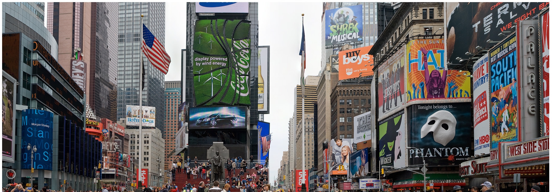
As you can clearly see from the signs in Times Square, there is a lot going on. The competition for attention is perhaps the most extreme example of signs known to man. If your sign layout does not stand out from the crowd then your effort will be in vain. Therefore it is crucial that you keep your message simple. If you have a lot to say then keep that information in a brochure or on your website, but do not try to cram it all into your sign.
Choice of Font Styles
When choosing font styles, many people want to be creative and choose an ornate style, however this may have a poor effect upon result of why you are making signs, to attract the reader to your business or event. For example, in the image below we show a sign layout for a Mountain Man Rendezvous.
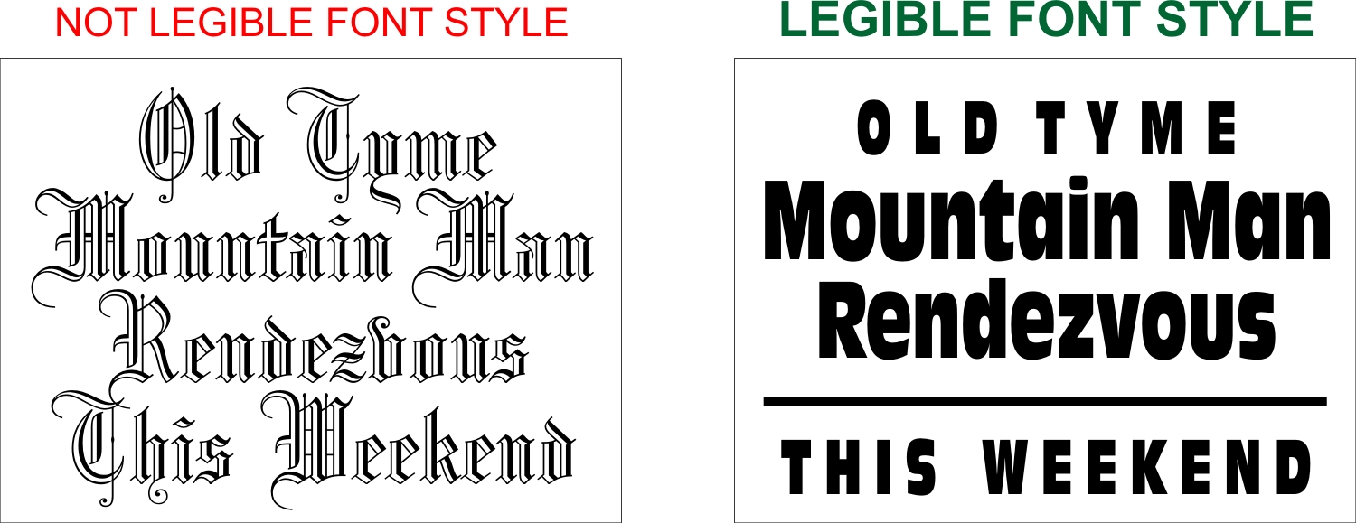
While the style of letter on the right might be more creative, you can bet that the reader will not read the message and therefore the event that is planned will fail due to a sign layout that is not geared toward readability. Whereas the sign layout on the right, does have some rugged characteristics than a typical block font, it is very readable and will be easily read and give more success toward the weekend event with a nicely designed sign layout. To find more sign layouts that will bring your event or business success click here to view our professional sign templates: http://www.lowcostsigns.com/low-cost-signs-design-layouts.html
Sign Design Layout: Color Contrast
When choosing colors in a sign layout it is very important to keep the Color Contrast to a level that helps the visibility and does not hinder the effectiveness of your sign design. Many times people are tempted to design their signs using colors that are near the same value. Values are simply put are colors do not have enough differences from dark to light. In the example below the sign design on the left shows a red and blue sign, while these colors may compliment each other it makes for a horrible design and the values of the two colors are the same. This means that the reader will probably run rather than read your message.

The sign layout on the right is an example of an effective contrast scheme in the sign design. Using two similar valued colors, the yellow and the white are stark contrasts to the dark blue background of the sign. When designing a sign, it is important to use colors that stand out well against the background of at least a 50% or more percentage. This will give your reader a design that maintains the visibility.
Effective Sign Design Layout: Summary
To summarize details of creating an effective sign design layout, you have seen the examples of font styles and how to arrange the message so that the reader can read the sign without thinking too much about the message. You have also learned about readability competition and how important it is to keep your message simple and to keep your font style legible. In addition, choosing an appropriate color scheme is equally important. We encourage you to use our well thought out, professional sign design templates to achieve reader success for your signs that you purchase online at LowCostSigns.com. You will find that all of our online sign design templates are designed from seasoned graphic designers with years of experience. When you choose a sign template from our product gallery, you are choosing signs that are winning designs!
Leave a Reply
You must be logged in to post a comment.